Refining The BIG Idea
Posted: August 24, 2017 Filed under: Field, Graphic Communication Leave a commentSince the final feedback review for the BIG idea project I had an incomplete book with a blurry and confused intention. Following advice from peers and tutors I had goals to clear up the intention of the book with an introduction page and a contents page to break up the information I was using. I played around with, added and changed parts of the design to produce a finished first draft design.
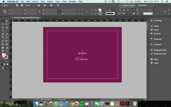
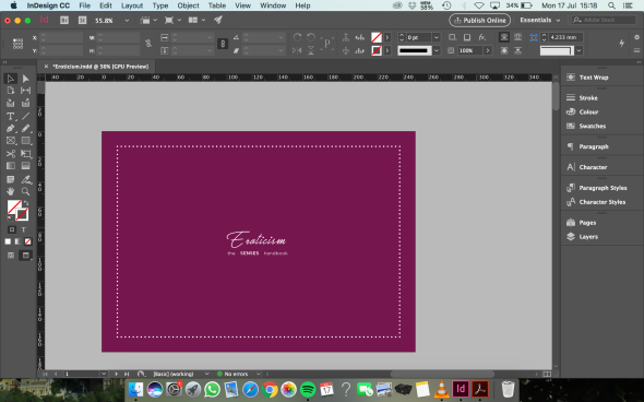
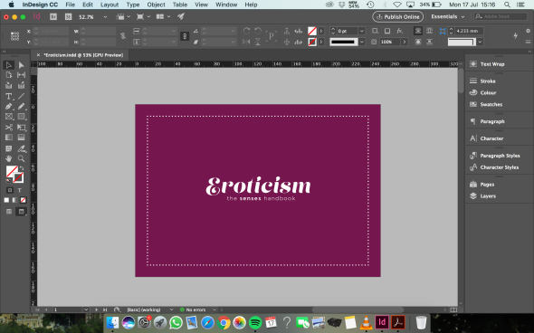
I tried a different approach to the design by experimenting with the colour scheme and the design of the book cover. I wanted the design to be more minimal with focus on the typography. Although the introduction and contents added more clarity to what the book is about, the design I later realised, was looking messy and illegible. It needed to be made even simpler and feel more erotic than it currently did. The existing colours of a bright but still light pink, white and raspberry pink I used made the design feel too innocent and dated, rather than sexy and sophisticated.
Using the existing content, I decided to start the design from scratch as I wasn’t satisfied with my first attempt. I completely changed the layout and style of the book, going for a dark grape/red wine colour scheme on a small B5 landscape sized frame that would give me more space and scope to design. In addition, the point of the initial book was unclear so I refocused the intention of the book – to explain eroticism and its true meaning through a small handbook that focused on the five human senses.
I began by focusing on the style of the book cover so that it would inform a consistent design throughout the inside of the book. This led me to pairing one of my favourite sans-serif typefaces, Gotham, with a display typeface called Lust Script, a bold yet elegant typeface. The two typefaces worked together well on the cover and the inside pages of my Eroticism book so I decided to stick to the two so as not to make the design style overly complicated and messy.
Having got a new and improved design style I begun designing the layouts of the content and pages within my eroticism handbook.


With a refined book design with all its content inserted and designed, I played with the main colour to make it a red wine colour, emphasising sophistication and elegance. The book had improved a lot since I first began visualising the idea. Though, there was still something missing and the piece still seemed a bit flat. I played around with gradients and tints within the design, applying it to the general frame on each page and the quote marks.
When I was finally satisfied and happy with my final draft I proof read it myself and got someone else to before I sent it to print. Below are mockups of the final design as the collection for my printed version is not ready in time for my deadline.
Penguin Book Cover Refinements
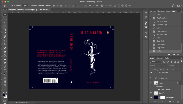
Posted: August 10, 2017 Filed under: Graphic Communication Leave a commentI went back to the book cover I designed for the non-fiction novel In Cold Blood by Truman Capote. Original design below:
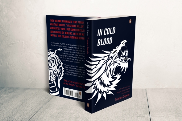
The illustrations on the cover are inspired by the tattoo’s that inked the two murderers in the novel. However, I had a couple other tattoo designs that I wanted to try out and see how they worked out on my cover design. I played around with another tattoo design of a snake curling around a dagger that was inked onto the character Perry.
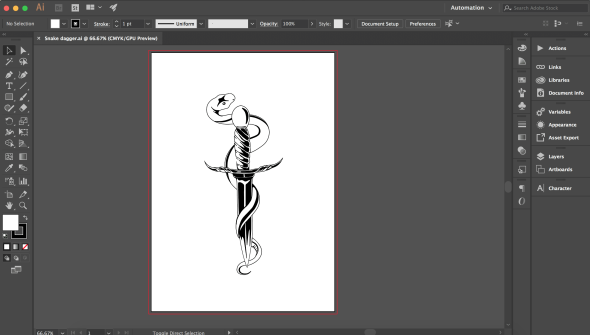
I looked back to the original photos of the two murderers to attempt to make my design as realistic as possible in comparison to the actual tattoos on the criminals. I used this new image along with the original dragon and skull illustration to play around with a new cover design.
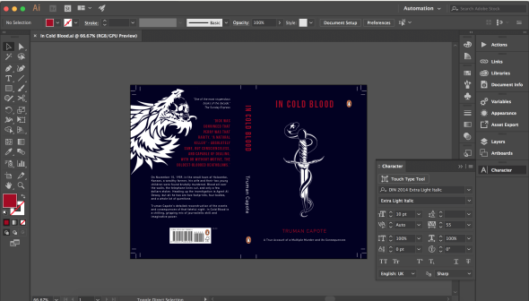
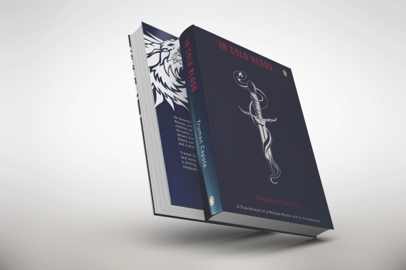
Using my new images I produced a design that was simpler and more aesthetically pleasing. Once I was happy with the layout and typographic hierarchy I put my final design into a mock up to see what it would look like around a book and was extremely satisfied with the result of my new design.
FMP: Outcomes
Posted: April 24, 2017 Filed under: Uncategorized Leave a commentNow that I had established the identity and a logomark for my festival I could begin producing outcomes. Here’s what I came up with in time for the final presentation.
Line up Posters:
Wristband:


Flags/Banners:


I would have liked to have produced more touch points in time for the presentation however I didn’t anticipate how time consuming it would be working with an abundance of triangles. From what I have produced so far I have received positive and constructive criticism from peers and tutors. It was suggested in my feedback that I produce some posters that are less content heavy for easier reading.
In addition to the current touch points I have produced, I plan to create designs for other touch points such as a brochure/festival guide with lanyard; ticket designs; map design; T-shirts; and web design and social media promotion. From this project I have had a lot of fun but I must crack down hard to get the whole project fully finished before setting up for the exhibition and the final summative assessment deadline.
FMP: Identity Development
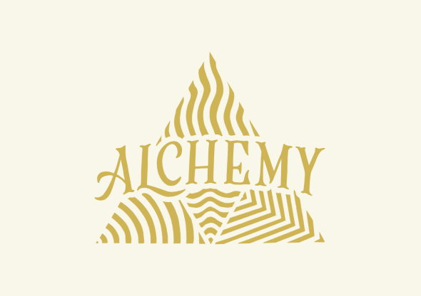
Posted: April 11, 2017 Filed under: Field, Graphic Communication Leave a commentI was so pleased with the aesthetic outcome of my prints, I felt they were beautiful on their own but it was time to put them to use to produce my identity and outcomes. I still needed to produce the essential part of the identity which would be a logo for the festival. Since I decided to amalgamate the topic of alchemy and festival design, the most obvious title for the festival was simply ‘Alchemy’.
To help with the design of the logo I looked back at sacred geometry (which is a constituent in alchemy) to inspire me on ways I could use my triangular symbols to produce a logo.


Some of the geometric shapes and patterns were very complex and other were more simple. I decided to go with a minimalist design inspired by triangle 3 (left image) as it meant I could fit all four of my symbols into one shape that represented the idea of togetherness and unity.
![]()
As the main goal of Alchemy is to transform elements into gold, it seemed suitable to make the main logo a golden colour as it brings together the elements. I still needed the type so I took inspiration from a book cover of the novel “The Alchemist” to produce my logotype.
FMP: Experimentation
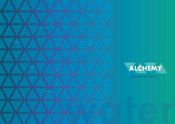
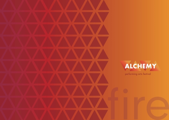
Posted: April 11, 2017 Filed under: Field, Graphic Communication Leave a commentIn a group tutorial I explained my concept of combining Alchemy into a festival to the tutor and my peers. I showed them my visual ideas and some digital experiments I’d created using the established triangular alchemical symbols for the elements: water; earth; air; and fire.
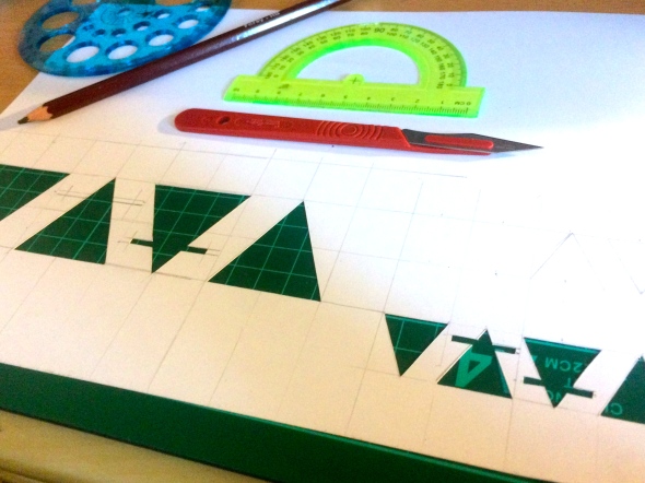
Having discussed what I had produced for my project to date, I established that these first experiments didn’t communicate a festival vibe and that these were too formal and clean. The group seemed to like the use of triangles but felt that my project needed something more natural and authentic. I suggested I had thought of making use of the print facilities to produce imagery and they all agreed this would be a good idea. So, following this discussion, I went home and started coming up with ideas for stencils that I could use to screen print. As I had been focusing on the elements I continued to experiment with the triangles.
I didn’t want to cope the alchemical symbols for the elements, so I decided to alter them into my own versions. I created patterns for each elements which would reside within the triangles.
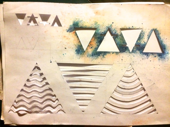
I tested my miniature stencils with Brusho powder (a kind of powder paint/ink) but the outcome wasn’t as vibrant or exciting as I had hoped, although it did give an insight into what my prints could look like. I eventually made larger individual stencils in order to screen print my symbol designs. The outcomes are below:
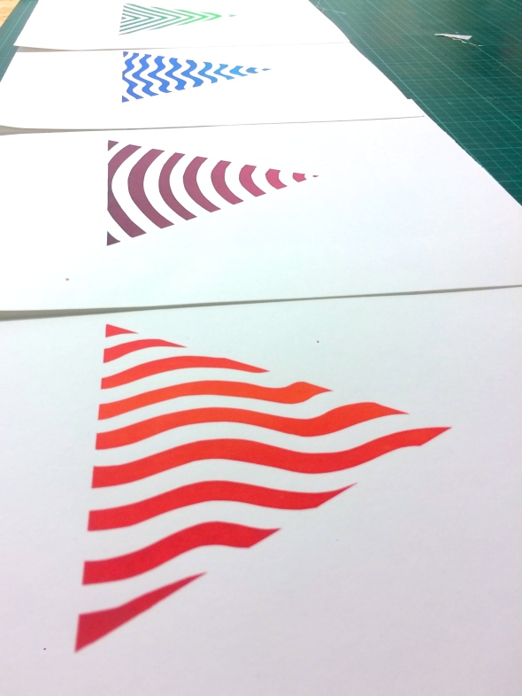
I was really pleased with these outcomes and was excited to start using them to produce outcomes for my festival. I scanned them into Photoshop to tweak slightly and exported them as PNG files so they could be used across all backgrounds.


FMP: Concept Research & Development
Posted: April 11, 2017 Filed under: Field, Graphic Communication Leave a commentSo, having made the decision to focus on the concept of spiritual Alchemy and combine that into my concept festival, I began to develop the focus through visual research and ideation. Firstly, I focused on visual research for festivals that already exist to explore the different visual styles used, and the feelings and vibes that are portrayed through their designs.
I also researched different festivals across the UK and the rest of Europe and what these festivals consisted of. I found most of my information on festival websites including:
- http://www.boomtownfair.co.uk/
- http://www.bestival.net/
- http://eldoradofestival.com/
- http://www.secretgardenparty.com/
- https://parklife.uk.com/
- https://www.tomorrowland.com/en/festival/welcome
- http://www.budafest.co.uk/
- http://www.outlookfestival.com/
- http://www.fiberfib.com/en/
- http://www.glastonburyfestivals.co.uk/
- http://www.cheltenhamfestivals.com/
- http://www.bst-hydepark.com/
- http://www.wirelessfestival.co.uk/
- http://www.readingfestival.com/
Having found a range of visuals for festival design, I begun to continue researching visuals for Alchemy.
I got completely caught up in the visual research as I found it so exciting. In a tutorial I spoke with one of the tutors who advised me to my ideation by first creating an identity for my festival. By creating the identity I would be able to produce the brand and then onto the promotion and execution of outcomes. Eventually I begun ideation and sketched ideas for the identity of my festival.


FINAL MAJOR PROJECT
Posted: April 3, 2017 Filed under: Field, Graphic Communication Leave a comment
Final Major Project (FMP) is exactly what it describes – the final major project of my time on the graphic communication course. For this project we were given the freedom to choose what we wanted to create and produce but with high expectations for the whole project as well as outcomes.
My initial thoughts for my FMP were revolved around stars, constellations, spirituality and magic and begun imagining giant graphic displays and information graphics. My brainstorming on these themes led me to the topic of Alchemy, an extraordinarily complex subject that consists of an ancient form of chemical purification and spirituality. The main aim of Alchemy is to transform matter into gold but the subjects itself expands into all sorts of diverse areas including spiritual elevation and purification. I decided that I would like to combine my ideas to produce a festival with a running theme of alchemy, magic and spirituality.
I did some research through books including ‘Astrology, Magic and Alchemy in Art’ which taught me about Alchemy as well as giving visual representations. In addition I watched documentaries such as ‘This Was Tomorrow’ which gave me and insight into the natural tribal essence of festivals that bring people together.


“We are here united in such a positive environment, a cultural phenomenon.”
Armin Van Buuren, ‘This Was Tomorrow’
Having done extensive research into the extremely complex subject of Alchemy I noticed several connections between the topic and the communal atmosphere of festivals.
Alchemy is deemed as an early form of chemical technology and explorations of substances (mainly metals) with the aim of transforming them into gold and silver. The medieval origin of Alchemy explains the involvement of practical chemistry and purification, and offers the possibility of hope and redemption of evil. Within the chemistry of Alchemy there is a focus on metals, nature and the elements (water, air, earth, fire). Alchemy allows the elements to transform into one another by a simple alteration of one of their properties. The theory of the elements derives from Aristotelian physics by which they are an admixture of cosmic qualities (hot, cold, dry, moist). Each is associated with a metal, a zodiacal sign, a season, a human temperament and many more components. The metals associated are seen as representatives of various stages of spiritual elevation of the human psyche.
The Alchemist himself aims to create the Philosopher’s Stone (the Elixir of Life) which is a magical stone that can transform matter into gold. With patience, the Alchemist would be rewarded by the Gods and transformed into a superhuman. The Quest for the Elixir of Life is the Alchemist’s goal. The stone itself is seen as a symbol of the connection between man and god, heaven and earth, and the spiritual elevation and emblem of the creative imagination and human psyche. Alchemy is seen as the ‘greater work’ that produces the Elixir of Life and has been defined as a spiritual guide that is the art which most profoundly imitates nature. A fundamental part of Alchemy is that it illuminates the human mind seeking nature and transforms the body into spirit. This fundamental contributes in history to the discovery of the unconscious part of the human psyche.
Essentially, there are two parts to Alchemy – operative Alchemy and spiritual Alchemy. Combining elements of Alchemy with my concept festival will focus on the spiritual side of the topic which will hopefully demonstrate an alchemical journey to spiritual elevation.
The Erotic Experience
Posted: April 3, 2017 Filed under: Field, Graphic Communication Leave a commentFollowing my initial research and exploration into the subject of eroticism I begun ideation and brainstorming.
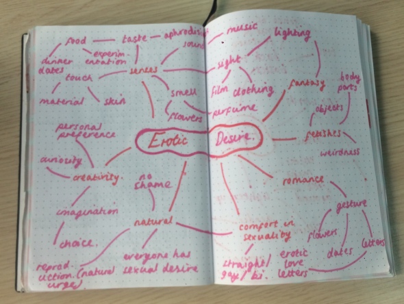
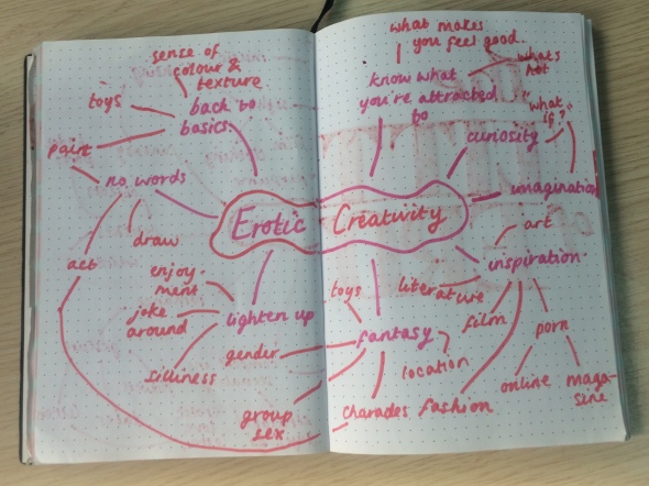
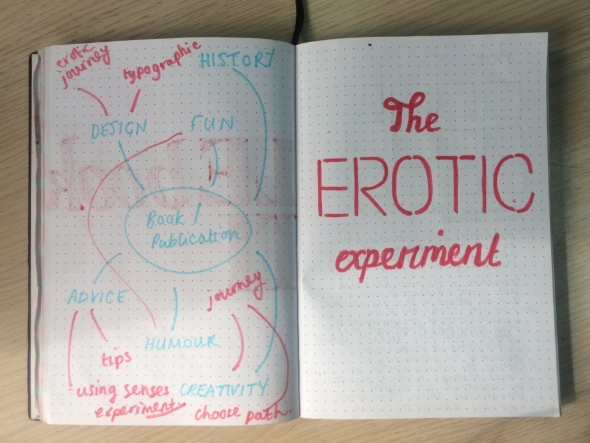
I wanted to produce some kind of tips and advice guide to eroticism. The seemingly best way to produce this would be through the form of a publication. The book would include an explanation of eroticism, and tips would be given on how the reader can embrace eroticism. The book would also explore the relationship between eroticism and the five senses, ways in which these senses can be utilised and experimented with.
Some research on eroticism and the senses I gained is shown below:
As the content for my book would be made up of lots of type and text, I decided to make it a solely typographic book where I could experiment with the design and different ways of using typefaces to create something beautiful. I used content from my research and exploration into eroticism to help inform my typographic book as well as my research on the senses. What I was able to produce in time for the formative assessment is below:
Following the assessment critique and feedback, i must now finish my book and make it clear what the purpose of the book is about by adding an introduction and adding in spreads about the 5 senses.
The Big Idea commences..
Posted: April 3, 2017 Filed under: Field, Graphic Communication Leave a commentFor this project I had to choose a word from a collection to use as the stimuli for the Big Idea. From the collection there were three words that caught my attention and interest which were addiction, asylum & eroticism. I decided against addiction as so many other people in the class had chosen this word and I wanted to begin my project using a word that was more unique. I also decided against asylum as I felt like I would end up doing something quite political and I didn’t want to get carried away in that. So, I ended up with the final word left – eroticism. I thought that it could be exciting to explore the term and gain a proper understanding of it, and to be able express this understanding to others who perhaps have taboo or negative preconceptions of it.
I began by finding out what others preconceptions were (including my own) to get an insight in how eroticism is perceived. Most people said that it made them think of pornography, sex shops and sexual fantasy. Having found out this general consensus I began with research on the term, looking at its definitions as well as what it is applied to. One definition of eroticism is that it is anything with an erotic and sexual quality.
Below is a presentation of my initial research and findings.
Afterlife: Lee Fairwater Tips & Advice
Posted: March 21, 2017 Filed under: Graphic Communication Leave a comment25 things you need to know before going into the creative industry:
- Make A Plan: know what you want to do – “Everyone has a plan ‘till they get punched in the mouth” Mike Tyson
- Your Portfolio Is Your Life Story: www.tonycullingham.com/advanceonfolios
- Know The Industry: 4 groups – Advertising; Brand; Digital; Print. Research agencies, roles, works, directors, awards etc (check this religiously)
- Never Stop Learning: read everything, do tutorials, watch videos, go to meets, store knowledge & share knowledge
- Understand The Difference Between An Idea & Execution: an idea is a strategic concept, execution is creative output of said concept (the ad/design/film/etc), always have a strategy and create with purpose
- Focus On The Benefits: how is this going to change the end users life?
- Keep It Simple & Elegant
- Scamping/Sketching = Strength
- Prototype Then Build: prototyping is the art and science of faking it before making it. Good is average – only settle for great and award winning
- Build A Network & Meet Other Creatives
- Find Yourself A Mentor Today!
- Brand Yourself: remember your tastes and be true to who you are
- Push The Boundaries: don’t be afraid to move out of your comfort zone, always ask questions, never be afraid of anyone & expect to hear “no” a lot
- Create A Thinking Environment: with purpose. Change scenery, consider every idea, never make fun of someones idea, make notes & document all thinking
- Present Better Than Don Draper (Madmen): a great commercial creative is also a great client manager – practice, practice, practice both selling & speaking
- Be Resilient: stay strong and don’t listen to anyone who calls you or your work rubbish
- Radical Candour: try to be open and honest with feedback without upsetting a person
- Choose When To Take Advice & When To Leave It: but listen to every bit of advice thats given to you
- You Should Get Paid With More Than Money: knowledge, accounts, teams, leaders, opportunities (equity/shares/promotions/bonuses) – discuss all this before signing any contract
- Never Sell Yourself Short: charge what is worth your time
- Know When To Move On: “this is your life and its ending one minute at a time” Chuck Palahniuk, Fight Club Author
- Procrastination Will Kill You: know your vices and avoid them, find a new environment, get started, ask for feedback – it will give you motivation
- Be Nice: break the cycle of power and authority by being mean to people – work hard + be nice + be on time = success
- LOVE IT

